The recent font shift in the US State Department from Calibri to Times New Roman has sparked a contentious debate. Secretary of State, Marco Rubio, initiated this change, calling the Calibri font "informal" and "clashing" with the department’s official letterhead. The switch underscores a broader political narrative and raises questions about accessibility, professionalism, and the role of fonts in official communications.
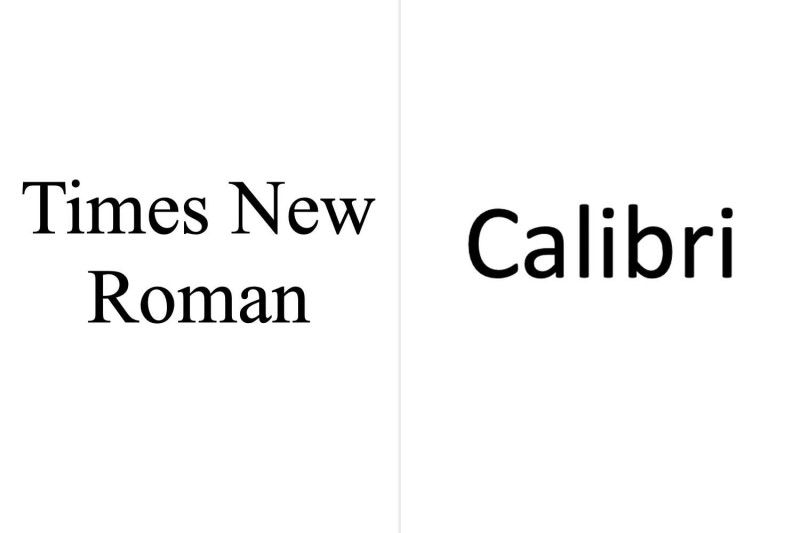
The U.S. State Department has a history of using Times New Roman as its standard font. This serif typeface, known for its readability and timeless design, was the departmental standard for many years. However, in 2023, the department transitioned to Calibri, a sans-serif font promoted for its accessibility and modern aesthetic. This shift was part of a broader initiative to enhance the legibility and inclusivity of official documents.
The return to Times New Roman, however, aligns with conservative views that reject diversity, equity, and inclusion initiatives as wasteful and contrary to merit-based principles. Secretary Marco Rubio, through an internal memo, emphasized that the department would be reverting to Times New Roman as its standard typeface, citing its more professional appearance and better alignment with the department’s official letterhead. This decision has fueled discussions about the symbolic significance of fonts in official communications and the broader implications for accessibility and inclusivity.
The Calibri font, a sans-serif typeface, was adopted for its readability and accessibility benefits. Designed to be dyslexia-friendly, Calibri has been praised for its modern and clean appearance, making it a popular choice for many organizations. The switch to Calibri in 2023 was part of a broader initiative to enhance the legibility and inclusivity of official documents, making them more accessible to a wider audience.
The decision to revert to Times New Roman has been met with mixed reactions. Critics argue that the switch undermines the department’s commitment to accessibility and inclusivity, while supporters praise the return to a more traditional and professional typeface. The debate highlights the political and cultural significance of fonts and their role in shaping official communications.
With the political and cultural significance of fonts becoming a focal point, the US State Department's decision to revert to Times New Roman from Calibri highlights the broader implications for accessibility, inclusivity, and professionalism in official communications. The shift reflects a clash between traditional and modern values, and the ongoing debate underscores the importance of fonts in shaping the narrative and perception of official communications.